How color choices shape perception, brand, and user experience
When you visit a website for the first time, what’s the very first thing you notice — even before reading the text?
Color.
It sets the tone, evokes emotion, and builds an instant impression of the brand. Whether you’re creating a high-energy fitness brand or a calming e-commerce store for organic products, color is your silent ambassador. Let’s explore how the right color combinations enhance user experience and elevate your design.
🎨 Why Color Matters in Web Design
Color isn’t just aesthetics. It plays a psychological and strategic role in how users perceive your site and how they behave. Here’s what it can do:
- Build trust — Clean, consistent color use shows professionalism.
- Create brand recognition — Think of Coca-Cola red or IKEA blue.
- Guide user behavior — Buttons, CTAs, and accents stand out when colored properly.
- Evoke emotions — Calm, energy, excitement, sophistication — all from color.
🔥 Bold and Motivating: Fitness Website Palette
This palette is full of contrast and energy — ideal for a fitness or coaching brand that wants to inspire confidence and action.
- #CB00F5 – A vibrant purple used as an accent color to bring energy, motivation, and dynamic vibes.
- #121212 – A deep black background that conveys power, strength, and focus — perfect for discipline-driven spaces like fitness.
- #A1A1A1 – A neutral gray that balances the strong tones and brings in visual stability.
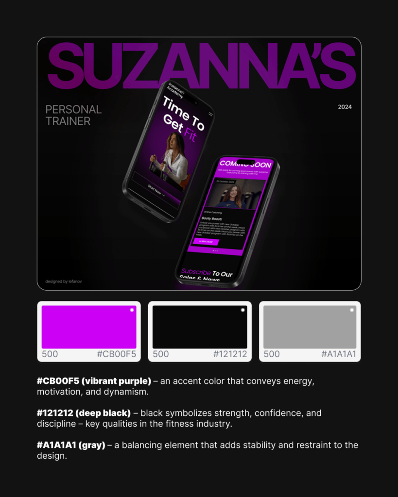
This combo works well for modern, high-contrast layouts that are both bold and user-focused. Purple draws attention to CTAs, while black grounds the brand in seriousness.
🪵 Natural & Premium: Aesthetic for Lifestyle or Handmade Brands
A more muted and earthy tone set — great for lifestyle brands, crafts, or high-end handmade products.
- #2A2A2A – Graphite black that signals stability and premium feel.
- #A38C7C – A soft beige-brown tone that evokes natural textures like wood and clay, making the experience feel authentic and warm.
- #D9D9D9 – A light gray that lightens the page and helps content breathe.
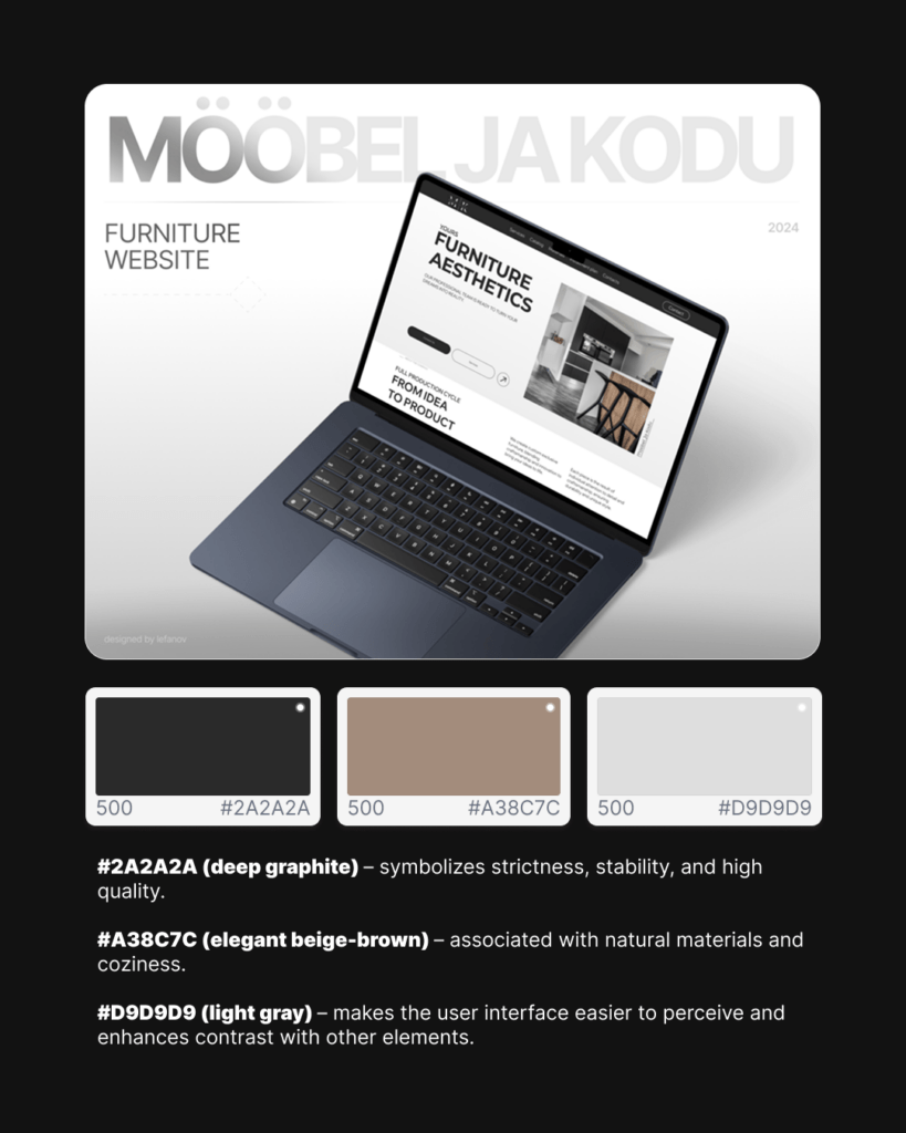
This palette is especially effective for creating calm, trust, and earthy sophistication, often used in minimalist e-commerce websites.
✨ Energetic & Modern: Great for Agencies and Startups
This palette combines contrast, brightness, and a hint of creativity — ideal for tech, creative studios, or innovative services.
- #FCD731 – A bright gold-yellow that radiates success, optimism, and momentum.
- #9B7EDE – A rich purple that adds innovation, creativity, and modernity.
- #121212 – Deep black that anchors the look and makes colors pop.
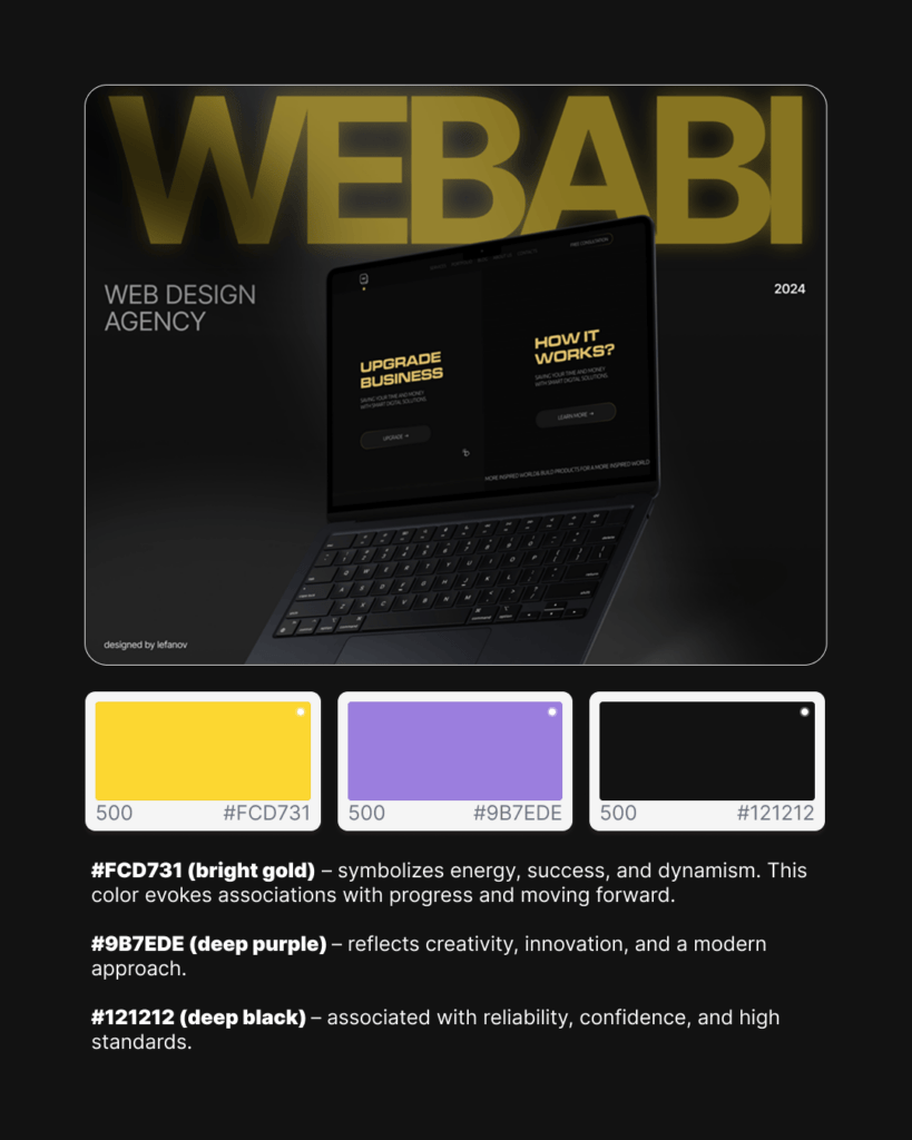
It’s a bold combination, perfect for capturing attention while showing confidence and professionalism. Works especially well in scroll-based interactive websites or agency portfolios.
💖 Feminine & Bold: Fashion, Beauty & Wellness Vibes
This palette is a masterclass in balancing boldness with softness — ideal for brands in beauty, wellness, or anything women-focused.
- #DD0353 – A rich raspberry pink that commands attention with passion and energy.
- #FBA1B7 – A soft baby pink to balance intensity with femininity.
- #FFF0F5 – A pastel blush tone that makes the design airy, light, and comfortable to look at.
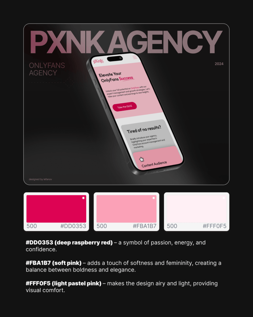
Perfect for brands that want to feel fresh, bold, and emotional all at once. The layered pink tones help with product-focused layouts and storytelling through visuals.
🔗 How to Use Color Strategically in Web Design
Color isn’t just about picking pretty shades. It must serve a purpose:
✅ Define your primary and secondary colors
Use one main brand color and 1–2 accent tones. Too many can overwhelm the user.
✅ Keep accessibility in mind
Ensure text contrasts well against backgrounds (especially important for mobile users and visual accessibility).
✅ Link color to your brand values
Are you calming and natural? Go with muted tones. Are you energetic and loud? Use bold, saturated shades.
✅ Stay consistent
Use colors across your koduleht, social media, and marketing to build recognition.
Want Your Website to Reflect Your Brand?
At Webabi, we don’t just make websites look nice — we create visual systems that support your business goals. Whether you’re starting from scratch or rebranding an old koduleht, we’ll help you craft a color palette and design that tells your story.
Let’s make your brand not only seen — but remembered.
Website Development Page
Free Consultation Page
